The Conspiracy Against User-friendly Software
How to design a user-friendly software: 1. Test the design 2. Identify the problems 3. Modify the design 4. Repeat step 1
Sounds easy, right? That is until time pressure, individual preference, market forces and other factors come in and conspire against the design.

The most common business model for software is to regulary release versions of a product, where each release contains more features than the previous. The new features give customers reason to open their wallets and upgrade their software. Ideally, the new version keeps the good features and adds more good features.
Ideally.
When a new version is released, the design of the next version has already started. From a business perspective, this is a good strategy because the company can keep releasing new features. From a design perspective, gathering and understanding feedback from actual users seldom happens, which is a necessary step to improve the product. Without feedback, the designers would not know that users are having problems printing in landscape or they can’t find the spell checking tool anymore. What used to be a simple thing to do now becomes a source of confusion.
Making features available, it seems, is not a difficult thing to do. There is no physical limit in how many items a menu group can contain or how deeply nested your menus are, or how many buttons you use. If your designing a web application, you can include a hundred links in a page and Firefox won’t complain.
The difficult part is deciding what goes where. What menu group should this be included with? Would this be part of the standard toolbar? Should it be introduced in a flash screen? Should this be at the top, middle, or at the bottom of the list? Even though there is unlimited space for every feature, every feature competes with each other for user’s attention. An item on top of a menu list is more accessible than the items at the bottom. It is not uncommon for users to suggest or complain that the feature they often use should be at the top of the menu list.
More features also mean more options for the users. If the additional features are for accomplishing different tasks, it does not present a problem to the users, for example, saving a document and printing it. But if you give the users many options to accomplish a single task, it would require extra brain processing. In the case of printing, possible options include page size, number of pages in a sheet, print range, orientation, and color. Every time you give users a choice, they have to think about something and make a decision.
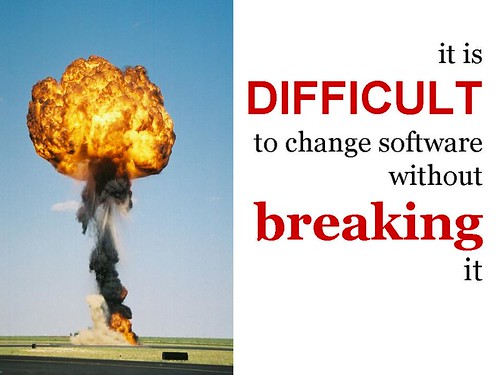
Features not only affect design but also the integrity of the software. As developers add more features, they also put in new code. The new code not only has the responsibility to implement the new features but also not to damage existing ones. As the code grows, complexity rises exponentially thus making it difficult to add new code and preserve the integrity at the same time.
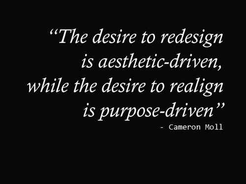
Business strategy is not the only factor that can work against a user-friendly software. Sometimes, the designers also work against good design. Making things better is a noble goal but sometimes it gets confused with simply making things different. A designer involved in several iterations of a product has the innate pressure to make things different from the previous. When you hear designers suggest a redesign, it should only be done if it is aligned with making things better like improving navigation, decreasing task completion time, or improving quality of search results.
Design is often confused with aesthetics. If you survey the job requirements from companies looking for web designers, the primary requirement is often an expertise in Adobe Photoshop. Aesthetics will make the design pleasing to the eye but may make it less comfortable to use. Usability can make the interface comfortable to use but can be uglier. New technology, like Ajax, can make the software more responsive but could be at the expense of aesthetics and usability.
Making aesthetics a priority is not confined to interface design. It is everywhere. We buy alarm clocks that looks beautiful but has unreadable numbers, or phones with vibrant colors but with a small keypad. When we moved to our new office, an admin staff asked what I think about our work area. I said the work area is too crowded and our developers would always hit the guy behind him when he stretches his arm. Puzzled, she was actually asking if I like the colors of the wall. Because if not, they will change it. But the alloted space for each developer would remain.
This is not to say that decoration is unimportant. Used properly, decoration can guide the users to help them achieve their goal. Aesthetics can help increase the probability of software or website being used, whether or not it is actually easier to use. A more accessible and usable product may suffer lack of acceptance making a noble goal, e.g. accessibility, useless in the absence of an effective visual presentation.
It is our nature to be biased towards attractive things — Nokia cellphones, iPod, BMW, and Paris Hilton. It is no secret that movie actors and actresses receive more attention and that, all other variables being equal, attractive people are preferred in hiring decisions. Attractive things also foster positive attitudes like affection, loyalty, and patience making people more tolerant of design problems. Even though an attractive software is not user-friendly, it can still become successful because once we liked something, our natural talent to adapt kicks in. When we are hook, forcibly or by choice, we find ways to adjust with the unusable interface. Over time, the interface becomes natural to us even though a 5-step task can be redesigned to become 2.
When users are already conditioned to do things in a certain way, design improvements can have negative results if not managed properly. In the case of web applications, the ability to make quick updates immediately available to users is a double-edge sword. Adding inline validation in the order-entry form will improve user experience but reorganizing the flow of the pages will present problems to users even though the change, as the designers see it, is an improvement.
The problem is designers often think of themselves as typical users. Even though design discussions revolved around “what if the user wants to…” and “i think the user will be confused if…”, it is our nature to project our own beliefs onto others. What designers think as improvement to the user’s experience is often just a result of his own biases. While the designer may be correct, designs that are product of internal discussions should be done if it matches the results of study with actual users. The are ways to involve the users as early as possible like releasing prototypes or chunking the interface into several iterations.
There is always the desire to make users happy. Still, designs can go wrong. One reason designs go wrong is the people involve have become so proficient in what they are building that they can no longer perceive the areas that can cause trouble to the user. Designers know too much and are accustomed to the software that no matter how hard they try, they can no longer put themselves in the role of a viewer. Predicting all the problem users will have, or the errors that will get made is an impossible task. The only way to know these problems and errors is to observe users and learn what they do. While designers are expert in the software they are working on, users are expert in the task they are trying to perform with the software.
Sometimes, teams are not allowed to talk to end users. The most common reason is fear of the designers telling the users too much. Sometimes, teams work for clients who may be concern about price and schedule but not on usability. Often, designers depend only on requirements that have been filtered by the people from marketing, support, and from the office of the CTO and CEO who all believe they have a better understanding of what the users want. Sometimes, they also have an opinion on how things should be designed which aggravates the situation the designers are into.
Design failures also happen when it is done not by designers but by programmers (sometimes by managers). Programmers know the value of simplicity in implementation and all things being equal, they would rather do the simplest solution that would work. This is a sound principle because as code grows, complexity rises exponentially. By implementing simple solutions, code becomes less costly to maintain. When one design option requires more code than the other, it is just natural for programmers to choose the design that requires less code to implement.

The factors working against good design are not hurdles that can be solved by a technical solution. Designing user-friendly software starts with the right mindset. It is very common for technical people to call users stupid every time they receive a complain for what is seemingly a trivial task. In this kind environment, no user-friendly software will ever get produced.
Some think good design is just common sense. While it is true that knowledge of quantum mechanics is not a prerequisite to good design, thinking that design is just common sense leads us to believe that we know what users want. We can guess and try as hard as we can but only by asking and observing users we will know what they want and the problems they are facing.
The right mindset knows that users are different and exactly opposite of you. What is easy for you, is hard for them. What is trivial for you, takes a lot of time for them. Users don’t think the same, don’t act the same, and don’t have the same experience as you do.